Recommended AI Tools
5We've analyzed the market. These tools offer specific features for create data visualizations.
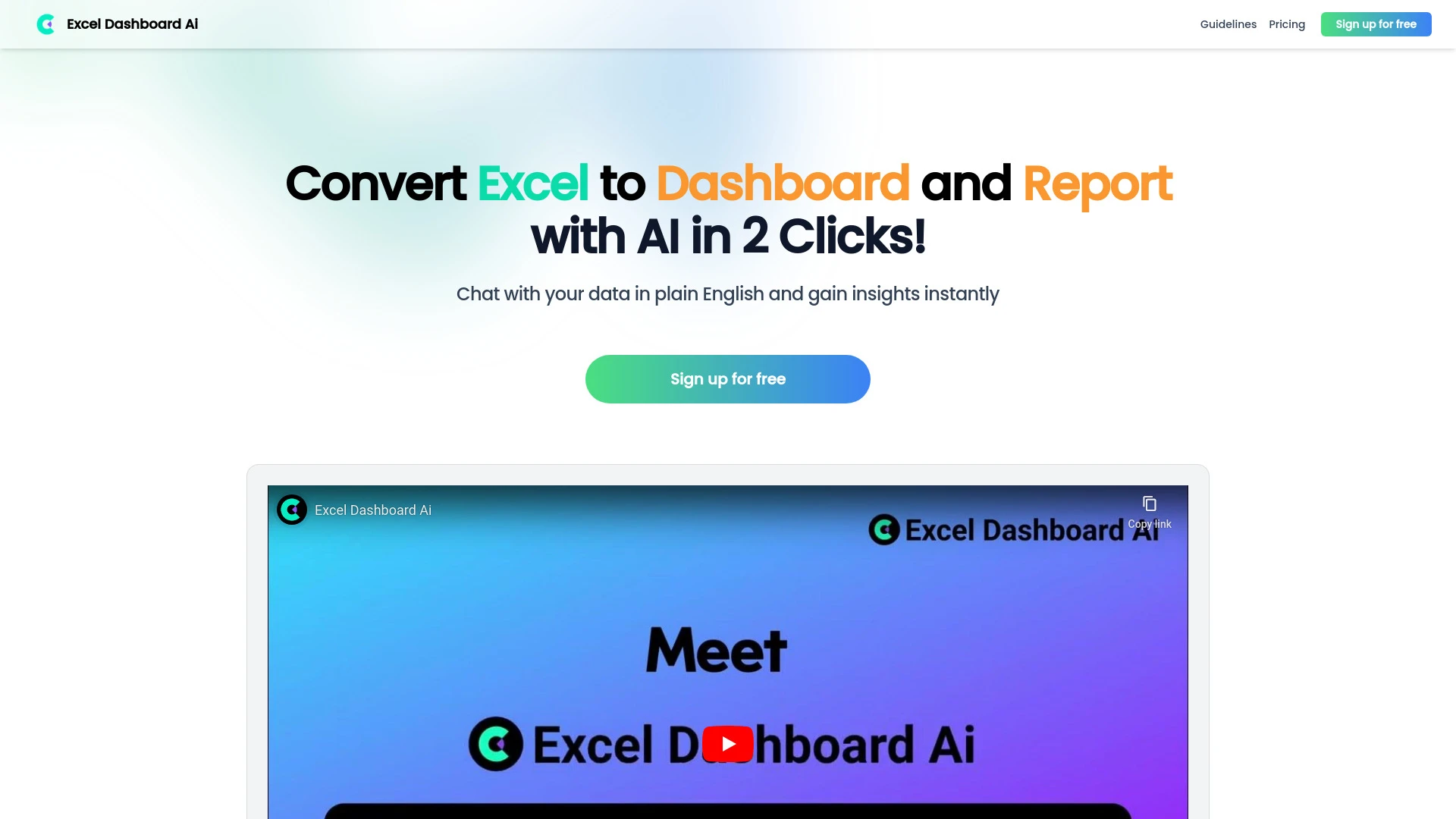
ExcelDashboard AI is an AI-driven tool that swiftly converts Excel data into interactive dashboards and comprehensive analysis reports.
- Instant conversion of Excel files
- Interactive dashboard creation
- Natural language commands for chart customization
AI Analysis
Why use this AI ExcelDashboard AI for Create Data Visualizations?
SmartVisuals
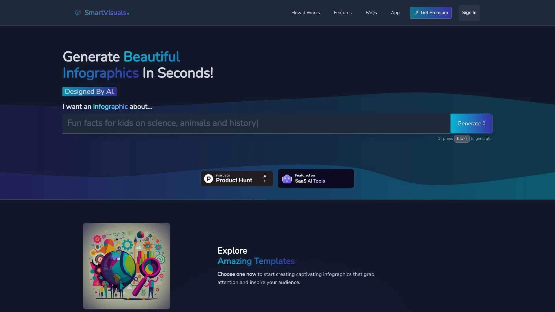
SmartVisuals is an AI-driven infographic creation tool that enables users to design stunning visuals effortlessly, eliminating the need for design exp...
- AI-Powered Infographic Generation
- Highly Customizable Templates
- User-Friendly Design Editor
AI Analysis
Why use this AI SmartVisuals for Create Data Visualizations?
DataGems
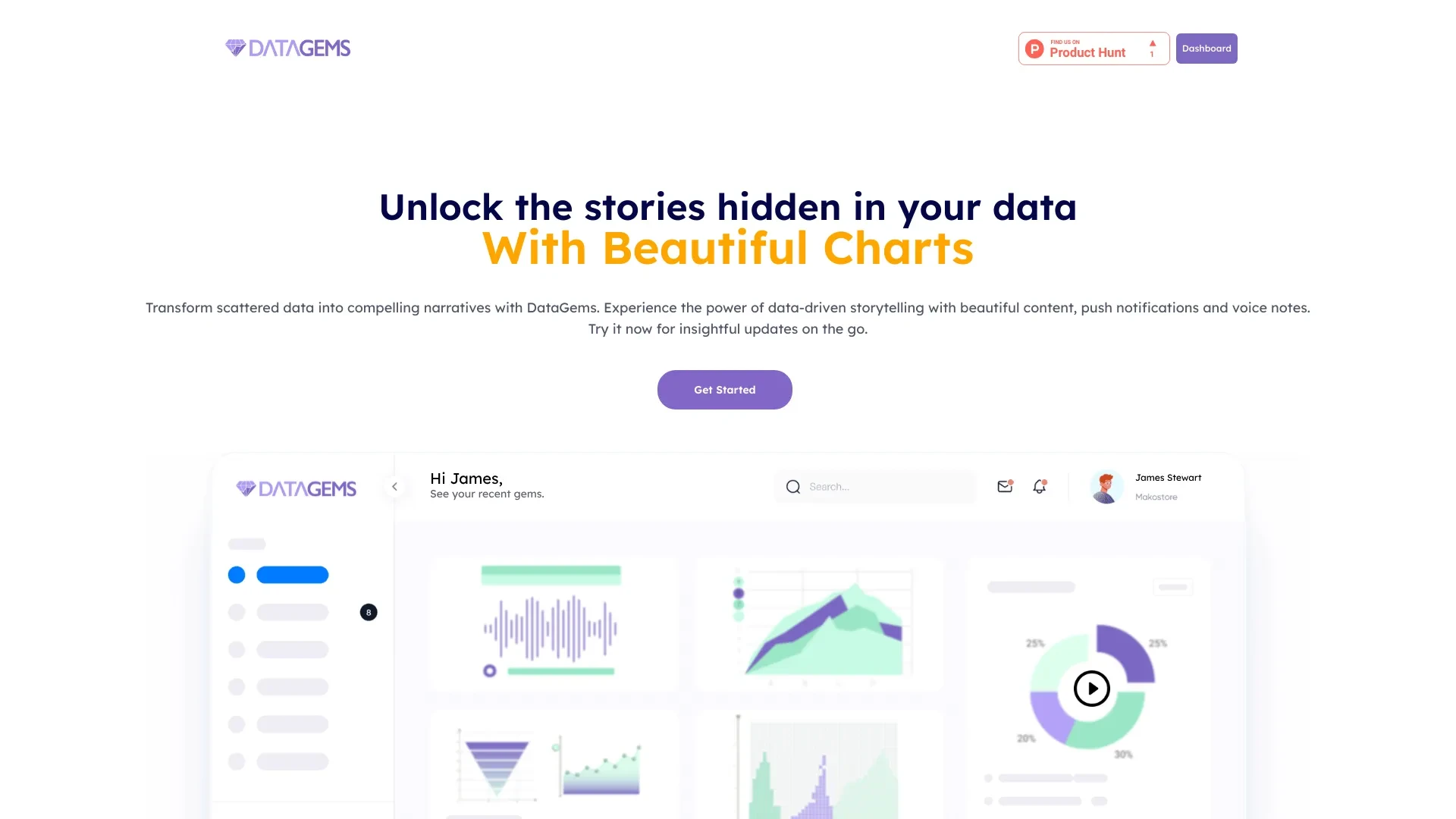
DataGems is an AI analytics tool that redefines how you visualize and narrate your marketing data, enabling compelling storytelling through data-drive...
- Data-driven storytelling
- AI-generated insights
- Intuitive Canva-style interface
AI Analysis
Why use this AI DataGems for Create Data Visualizations?
Daydream
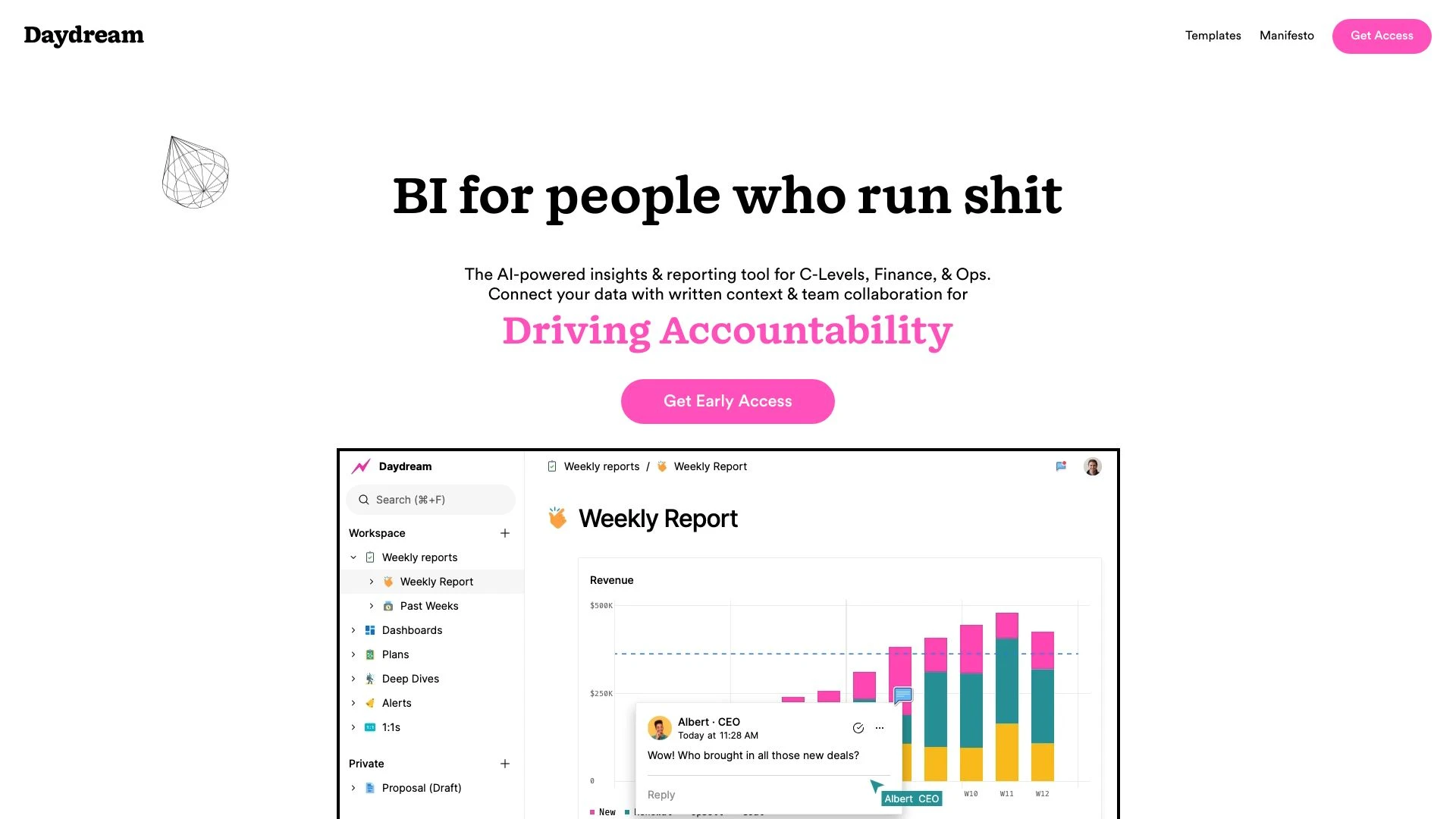
Daydream serves as an executive command center, transforming data into measurable business impact efficiently.
- Powerful dashboards
- Self-serve analytics
- In-depth reporting
AI Analysis
Why use this AI Daydream for Create Data Visualizations?
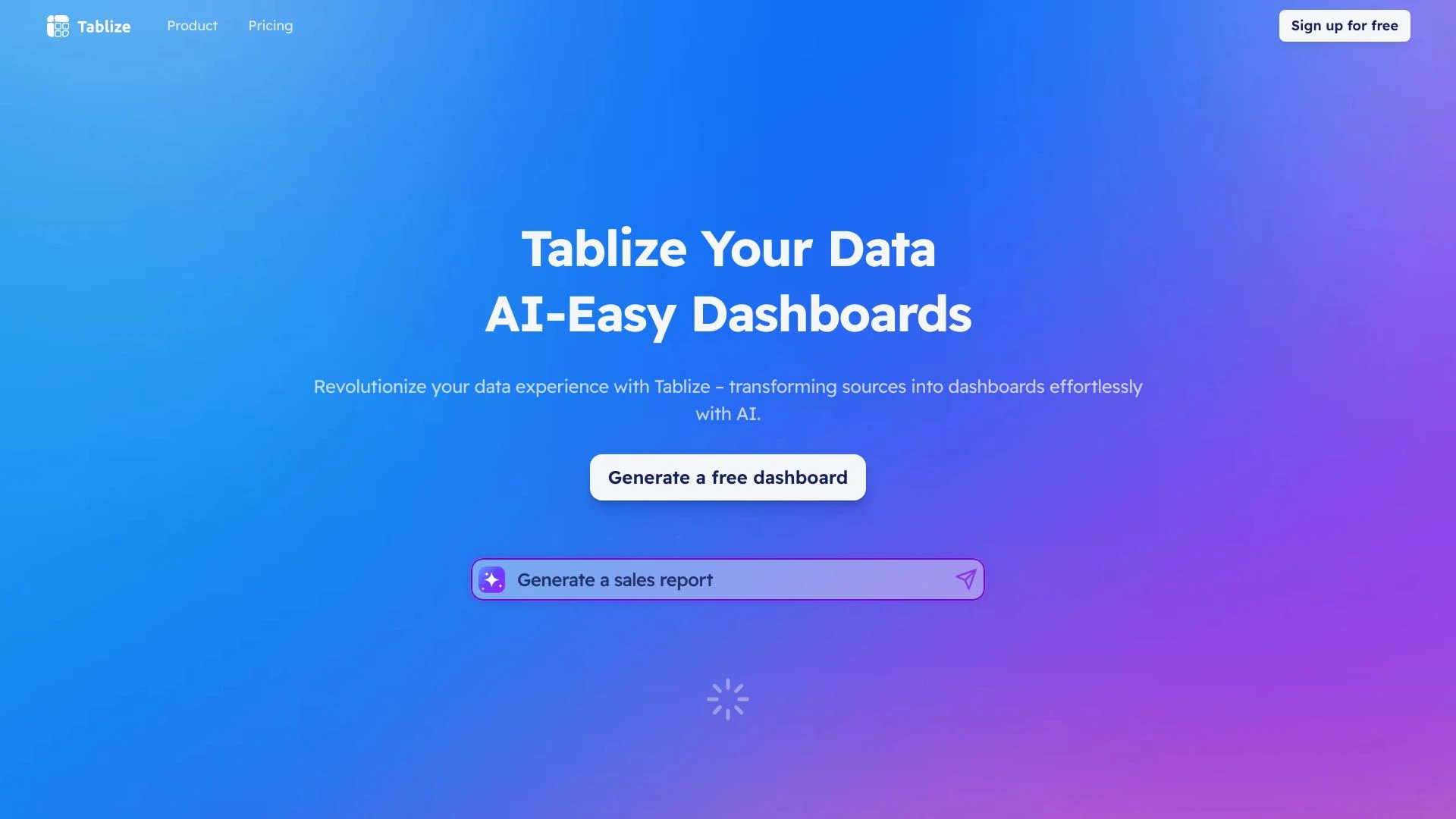
Tablize
Tablize simplifies data integration, enabling users to create AI-powered dashboards effortlessly.
- Transforms complex data into intuitive dashboards
- Real-time data visualization
- AI-powered with intuitive slash commands
AI Analysis
Why use this AI Tablize for Create Data Visualizations?
Practical Workflows
Don't just buy tools—build a system. Here are 3 proven ways to integrate AI into your create data visualizations process.
Workflow 1: Create a polished data visualization from a CSV for a beginner
- Import your CSV into the AI visualization tool and map columns to chart types (e.g., sales by region).
- Choose a recommended chart template and customize colors, legends, and labels for clarity.
- Export a shareable dashboard snippet or static image with alt text for accessibility.
Workflow 2: Automate daily visual reports for regular users
- Set up a recurring data pull from your data warehouse into the visualization AI tool.
- Create a single-screenshot dashboard template that updates visuals automatically at a fixed time.
- Schedule distribution to stakeholders with automated commentary and key insights.
Workflow 3: Build end-to-end visual analytics pipelines for power users
- Connect multiple data sources (SQL, cloud storage, APIs) and define data joins and transformations.
- Create a modular visualization suite with drill-downs, filters, and KPI toggles.
- Implement AI-generated insights and narrative annotations that auto-update as data changes.
Effective Prompts for Create Data Visualizations
Copy and customize these proven prompts to get better results from your AI tools.
Beginner Prompt
You are an AI assistant that creates a simple, clear bar chart from a CSV file with columns: Region, Sales. Generate a clean visualization showing total sales per Region with labels and a legend. Output only the chart image and a one-line caption.Advanced Prompt
Role: Data visualization consultant. Context: Monthly product performance dashboard. Constraints: Use a multi-panel layout with a heatmap for regional trends, a line chart for time series, and a bar chart for product categories. Output: a reusable JSON config for a BI tool plus a summary narrative with 3 insights.Analysis Prompt
Given two visualizations A and B generated from the same dataset, compare their clarity, accuracy, and accessibility. Provide a 5-point critique, suggest improvements, and propose color and labeling changes to reduce cognitive load.
What is Create Data Visualizations AI?
Create Data Visualizations AI is a category of tools that automatically generate charts, dashboards, and visual data stories from raw datasets. It’s designed for professionals and beginners to quickly translate numbers into accessible visuals, enabling faster insights and stakeholder communication.
Benefits of Using AI for Create Data Visualizations
- Faster turnaround from data to visuals, reducing report cycles.
- Consistent visual language with auto-styling and accessibility features.
- Automated insights and annotations that highlight trends and anomalies.
- Scalable dashboards across teams with role-based sharing.
- Lower technical barrier for beginners while empowering power users with automation.
How to Choose the Right Create Data Visualizations AI Tool
- Data connectivity: Ensure connectors for your data sources (SQL, cloud storage, APIs).
- Template quality: Look for rich, customizable templates for business scenarios.
- Automation depth: Assess how well the tool can automate updates, storytelling, and scheduling.
- Collaboration and governance: Check sharing, permissions, and version history.
- Cost vs value: Compare pricing tiers against required features and usage volume.
Best Practices for Implementing Create Data Visualizations AI
- Define data quality checks before visual generation to prevent misleading visuals.
- Start with a single source of truth and standardized metrics.
- Use accessible color palettes and add labels for clarity.
- Iterate visuals with stakeholder feedback and document decision rationale.
- Automate refresh schedules and governance to maintain trust over time.
AI for Create Data Visualizations: Key Statistics
In 2025, 62% of data teams adopted AI-assisted data visualizations, up from 38% in 2023.
Average time to produce a polished dashboard dropped by 45% after implementing AI visualization tools.
Top industries using Create Data Visualizations AI include finance, marketing, and healthcare.
48% of users report improved stakeholder understanding after AI-generated visuals.
Free Create Data Visualizations AI tools are used by 28% of teams as an entry point to paid solutions.
By 2026, 73% of organizations plan to automate at least 60% of their visualization workflows.
Frequently Asked Questions
Get answers to the most common questions about using AI tools for create data visualizations .
Create Data Visualizations AI refers to tools and features that automatically generate charts, dashboards, and visual narratives from data sources. It helps users transform raw data into meaningful visuals, enabling faster decision-making across teams and roles.
Begin by connecting a data source, selecting an initial chart type, and using guided templates to map fields. Iterate on visuals with automated styling, and leverage AI suggestions for layout and accessibility improvements.
Free Create Data Visualizations AI options are great for learning and small tasks, but paid tools typically offer deeper data connectors, automation, collaboration, and governance features that scale for business use.
Common issues include mismatched data types, missing data, or inappropriate chart choices. Check data mappings, validate column roles, adjust aggregations, and test visuals with sample queries to improve accuracy.
Related AI Tool Categories
Explore other AI tool categories similar to Create Data Visualizations that might interest you.
AI Spreadsheet
AI spreadsheets integrate artificial intelligence to automate data analysis, enhance decision-making, and streamline wor...
Digital Marketing Generator
The 'Digital Marketing Generator' leverages AI to optimize campaigns, target audiences, and enhance content creation. Ap...
AI Email Assistant
An AI Email Assistant automates email management, enhancing productivity and communication. It uses natural language pro...
AI Graphic Design
AI graphic design leverages algorithms to assist in creating visuals, automating tasks like layout generation and color...
AI Team Collaboration
AI Team Collaboration enhances teamwork by automating tasks, analyzing data, and facilitating communication. Tools like...
AI Data Mining
AI Data Mining leverages machine learning and advanced algorithms to extract patterns and insights from vast datasets. F...